Design System Audit
Role: UX / UI Design
Company: NY Phil
Dates: Sep 2024 - ongoing
Following the nyphil.org replatform—where functionality in critical user flows took precedence over full visual polish—I led a targeted design system audit to bring visual consistency and clarity to key site areas within the new CMS.
Objective
Ensure nyphil.org is fully functional for patrons focused on ticketing-related tasks—finding, purchasing, and managing tickets.
Scope
Homepage, event detail pages, calendars, artist roster listings, and individual content blocks
Strategy
-
Baseline Cleanup
-
Adjusted line height, typography scales, and font weights for readability
-
Standardized margin and padding to ensure consistent spacing
-
-
Component-Level Review
-
Documented variations across templates and flagged redundant or conflicting styles
-
Proposed class-based refinements to reduce one-off overrides
-
-
Alignment with Brand & CMS Flexibility
-
Cross-referenced styles with existing brand guidelines
-
Worked within the CMS’s component logic to ensure proposed updates were sustainable
-
Built documentation for internal QA and future design iterations
-
“We don’t have the components we need, so we end up designing around the system instead of within it.”
—Chaz
Front End Developer
Long-Term Impact
A shared style guide keeps every new page visually consistent, reinforcing trust and reducing design-review cycles
Cleaner CSS and fewer overrides lowered tech debt, letting developers focus on new features such as our accessibility audit, Apple/Google Pay, and in-house event forms
Pre-styled components let content teams publish updates quickly—crucial for last-minute program changes, press releases, and blogs
Standardized typography, spacing, and contrast set a WCAG-ready baseline for future designs
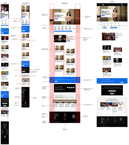
Example of annotations provided to developers during remediation for homepage template updates
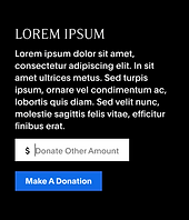
Evaluation Process
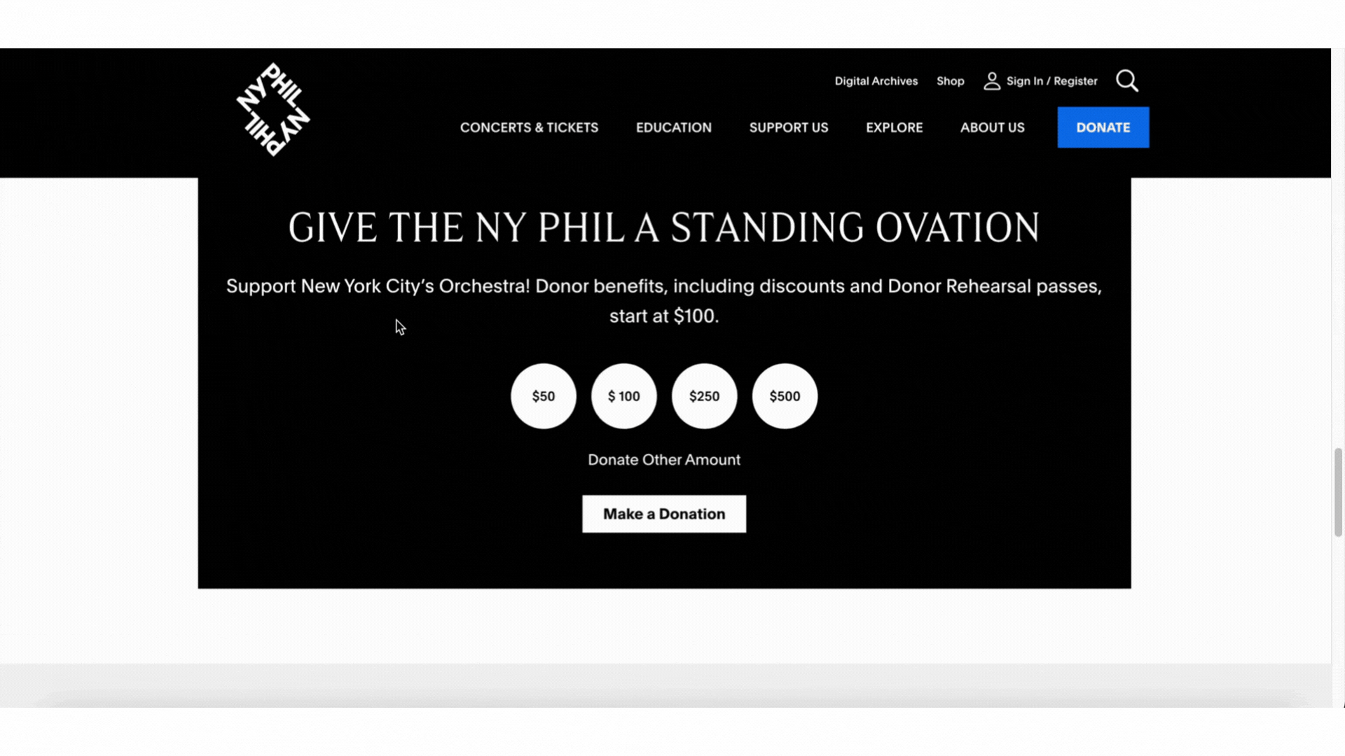
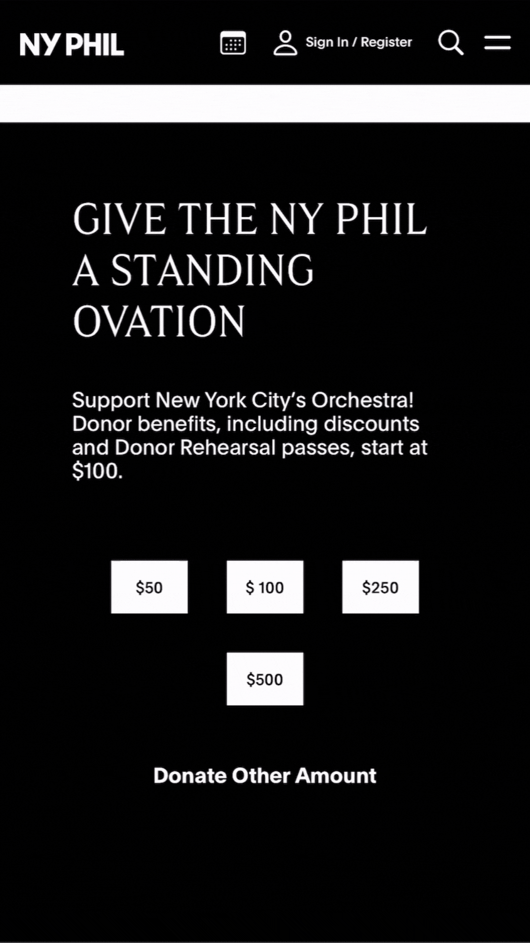
Example: Donation Panel

Purpose
-
Acts a persistent call-to-action for direct donations
-
Supports annual fundraising goals across artistic, educational, and operational initiatives
-
Visible across all site pages, including on mobile
Relevance
Cleaning up the styling helped developers work faster, with fewer one-off fixes, and reinforced system-wide consistency—making the codebase more stable and scalable.
User Flow & Pain Points
TASK: Select donation amount and add to cart
DEVICE: MacBook
BROWSER: Chrome, Safari
3 of 5 users said lack of feedback from interface after clicking "Make a Donation" made them feel uncertain
5 of 5 users said they expected the interface to change when they selected an amount button
Load time for the cart was over 5 seconds for all desktop users (tested on Chrome and Safari)
4 of 5 users clicked "Make a Donation" more than once during the 5-7 second load time

TASK: Select donation amount and add to cart
DEVICE: iPhone, Android
BROWSER: Chrome, Safari
2 of 5 users immediately clicked "Make a Donation" because they expected the amount button to do the same thing as the "Make a Donation"
3 of 5 users took 2-3 seconds to click "Make a Donation" after selecting an amount
Load time for the cart was over 5 seconds for all mobile users (tested on Chrome and Safari)
Styling Assessment
ORIGINAL
-
Rounded buttons are not used in branding
-
Centered title/paragraph with incorrect line height and font weights


PROPOSED
-
Rectangular, sharp edged buttons
-
Left aligned text content
-
Increased container padding to get rid of cluttered appearance


ORIGINAL
-
Pill shaped text entry
-
$ symbol outside of entry box
PROPOSED
-
Rectangular, sharp edged text entry
-
Moved $ symbol into entry box to match other similar web components
-
Introduced blue button, leading user's attention to action that will add donation to cart


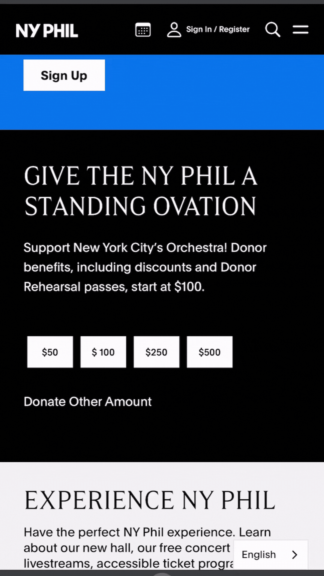
Proposed Design
"Make a Donation" button removed from default, reducing clickable options and providing clear options to select an amount before proceeding

"Donate Other Amount" option removed, providing clearer visual path to next step in donation process
"Make a Donation" button appears as a CTA for user, signaling that the user can now proceed with the donation

Hover state provides feedback by outlining and button


Button becomes text entry field
"Make a Donation" button appears as a CTA for user, signaling that the user can now proceed with the donation
Donation amount buttons removed, providing clearer visual path to next step in donation process

Hover state provides feedback by underlining text
Reduced amount of mobile buttons to alleviate cognitive load on user and provide clearer guidance


Blue CTA appears after selection, guiding user to next steps
Button becomes text entry field with instructions for user
Blue CTA appears after selection, guiding user to next steps
Testing & Feedback
The design-to-dev communication process was still being defined during this, leading to an iterative approach across three rounds.
Round 1

Dev provided with static image, minimal descriptions of visuals and behavior
Resulted in missed functionality, such as the white amount buttons activating the blue button
Round 2
.png)
Dev provided with detailed design tokens and more elaborate descriptions of visuals and behavior
Resolved functionality issues, but styling issues persisted like the rounded corners of the amount input box
Round 3
Dev provided with Figma prototype ready for hand-off, where they were able to utilize dev mode
Resolved almost all functionality and styling issues, a learning lesson that designer the more specific I can be with engineers, the more seamless the hand-off is.